Bollinger Bands are a technical charting tool designed to map the relationship between price and volatility. In a live market, price does not move in a straight line; it breathes, expanding during periods of high activity and contracting during periods of rest. This indicator provides a visual “envelope” that quantifies that breathing room using statistical probability.
What this is
The tool is built on three specific lines that overlay the price action:
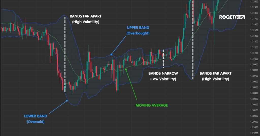
- The Baseline (Midpoint): This is a 20-period simple moving average. It represents the mean price of the asset over the recent past.
- The Envelopes (Bands): These are plotted at a distance of two standard deviations above and below the baseline.
Standard deviation is the core of the tool. It measures how far a set of data points is spread out from their average. When applied to a chart, these bands act as a dynamic boundary. Because they are mathematical, they do not require the trader to manually draw levels; they adjust automatically as market speed changes.
[ADS]
Why traders pay attention to it
Traders use these bands to solve a fundamental problem: determining if a price is “expensive” or “cheap” relative to its recent behavior.
Statistically, if you assume market prices follow a normal distribution, the price should stay within these two bands approximately 95% of the time. When the price touches or exceeds the bands, it represents an outlier event. It tells the trader that the current move is significant and that the market is operating at a statistical extreme.
What it tends to show on a chart
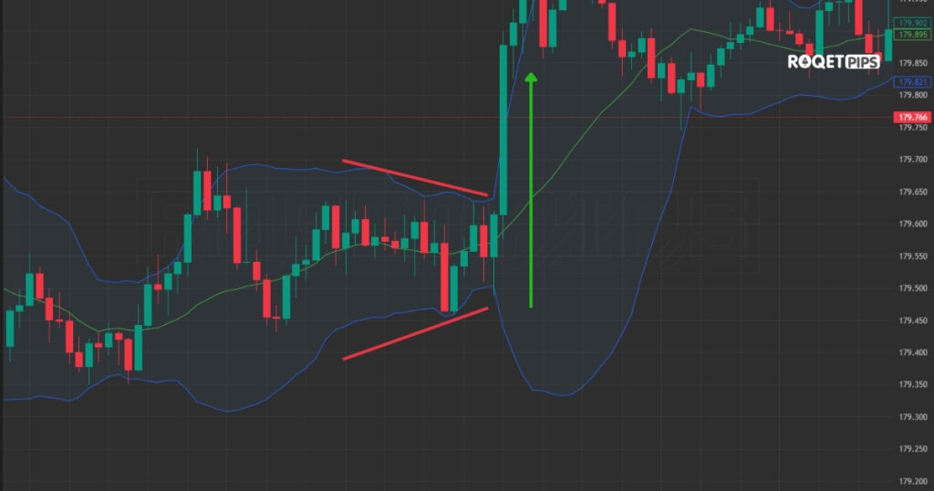
The most critical behavior to observe is the transition between low and high volatility, often called a “squeeze.”
During a squeeze, the bands contract until they are very tight around the price. This indicates that the market is in a state of extreme calm. Experience shows that these quiet periods are almost always the precursor to a violent expansion. While the bands show you that a move is coming, they do not predict the direction. The squeeze is simply a warning that the current equilibrium is about to break.
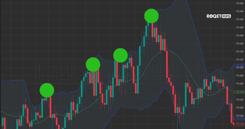
How traders usually apply it
In a sideways or ranging market, the bands provide a map for “mean reversion.” Price reaches the upper band, exhausts itself, and gravitates back toward the middle average. It then hits the lower band and bounces back up. Traders recognize this pattern as the market’s way of searching for value within a set range.
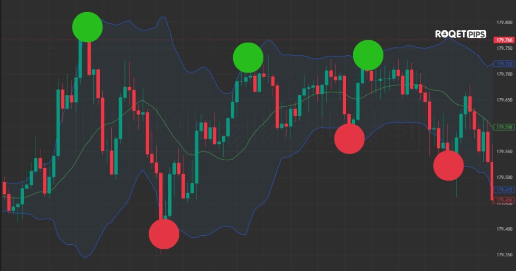
However, in a trending market, the application changes. During a strong trend, the price can “walk the bands.” This is when the price stays glued to the upper or lower band for an extended period as the trend accelerates. In this scenario, the touch of a band is a sign of strength and momentum, not a sign of a reversal.
[ADS]
Where it often gets misused or misunderstood
The most frequent mistake is treating a band touch as a “signal” to trade in the opposite direction. Beginners often see a price hit the upper band and immediately sell, assuming it is “overbought.”
In reality, a touch of the band only means the price is high compared to the 20-period average. If the market has entered a powerful new trend, the price can stay at the upper band while the bands themselves continue to expand upward. Fighting this momentum simply because a line was touched is a common cause of losses.
Finally, it is important to remember that these bands are “lagging.” They are calculated based on past prices. If a major event causes a sudden, vertical price spike, the bands will take time to react. The statistical boundaries provided by the tool are useful for identifying historical extremes, but they cannot dictate what will happen in a moment of unprecedented market stress.
Category: Market Structure
Tags: volatility, price movement, trading ranges, trend behavior, indicators, standard deviation
Leave a Reply